
OPEN AI’S REBRAND: A BOLD LEAP OR JUST A MOTION DESIGN FLEX?
OpenAI just dropped its first-ever rebrand, and let’s be honest—it’s giving “Black Mirror meets Apple aesthetic,” with a touch of that futuristic elegance we all secretly love. But here’s the kicker: while the visuals are clean, modern, and “human,” the internet is split. Some designers are raving, others are wondering if this is a rebrand or just an excuse to flex motion design. So, what’s the tea? Let’s dive in.
WHAT’S NEW IN OPENAI’S NEW LOOK?
The AI powerhouse, known for shaping the future of artificial intelligence, has decided it’s time to refresh its image. And honestly? It was due. The new branding aims to feel more organic, more human, and less tech-bro dystopian.
Here’s the breakdown:
New logo: A refined, more symmetrical version of their original “blossom” mark.
Custom typeface: OpenAI Sans—a geometric-meets-friendly font that’s sleek yet approachable.
Color palette glow-up: Think soft, natural hues inspired by horizons (cue the “AI meets humanity” messaging).
Motion-first identity: Animations are everywhere, adding a dynamic, living-breathing quality to the brand.
Sounds solid, right? But here’s where the debate kicks in.
WHO DESIGNED IT?
OpenAI’s rebrand wasn’t just an in-house job. The company collaborated with some top-tier creative minds to get this transformation just right.
Studio Dumbar/DEPT (a Rotterdam-based design agency) was brought in to refine the brand identity.
ABC Dinamo (a Berlin-based type foundry) crafted the custom OpenAI Sans typeface.
OpenAI’s internal design team, led by Head of Design Veit Moeller and Design Director Shannon Jager, played a major role in shaping the final look.
The goal? To create a cohesive and human-centric brand that reflects OpenAI’s shift from a research lab to a full-blown AI company leading the charge.
REBRAND OR JUST A MOTION DESIGN PLAYGROUND?
The design community isn’t one to hold back, and let’s just say opinions are flying faster than a ChatGPT-4.5 update.
Tobias van Schneider, former lead designer at Spotify, summed up the mixed feelings perfectly:
“It’s beautiful. But remove the motion, and what’s left? A solid, clean identity—but maybe not groundbreaking. Feels like the motion is doing the heavy lifting.”

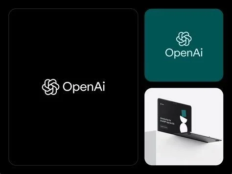
OpenAI rebrand. Image credit: OpenAI
This sentiment is everywhere. A post by Ostendo Design put it bluntly:
“The OpenAI brand refresh is dripping with irony. Every element is meticulously crafted, yet it feels like motion design takes center stage, leaving the static identity in the shadows.”

OpenAI rebrand. Image credit: OpenAI
Even Michael Bierut (you know, the Pentagram legend) chimed in, saying:
“Great design should work in stillness as well as in motion. When the movement stops, does the brand still sing?”
Ouch. But fair.

OpenAI rebrand. Image credit: OpenAI
SO IS OPENAI’S REBRAND A HIT OR A MISS?
It depends. From a branding perspective, OpenAI nailed a futuristic, human-friendly look that aligns with their mission. But from a design balance perspective, some argue that static elements were left behind, relying too much on movement to tell the story.
Imagine if Nike’s swoosh only looked good when animated—would it still be iconic? Probably not. The best brands—Apple, Google, even Barbie—work seamlessly in both motion and stillness.
WHAT THIS MEANS FOR DESIGNERS & AI BRANDS
For creatives working in AI branding, OpenAI’s move is a lesson in how motion-first design is taking over. But the challenge? Ensuring the brand still resonates when the movement stops.
Key takeaways:
Motion design is the future, but don’t let it overshadow core brand elements.
AI brands must feel human—but balance minimalism with personality.
Static design still matters—because not every platform supports motion.
At House of gAi, we’re all about AI-powered creativity that enhances human expression, not replaces it. And OpenAI’s rebrand is proof that AI brands need to get their visual identity right, not just in motion—but everywhere.
So, what do you think? Brilliant move or motion design overkill? Let’s discuss.